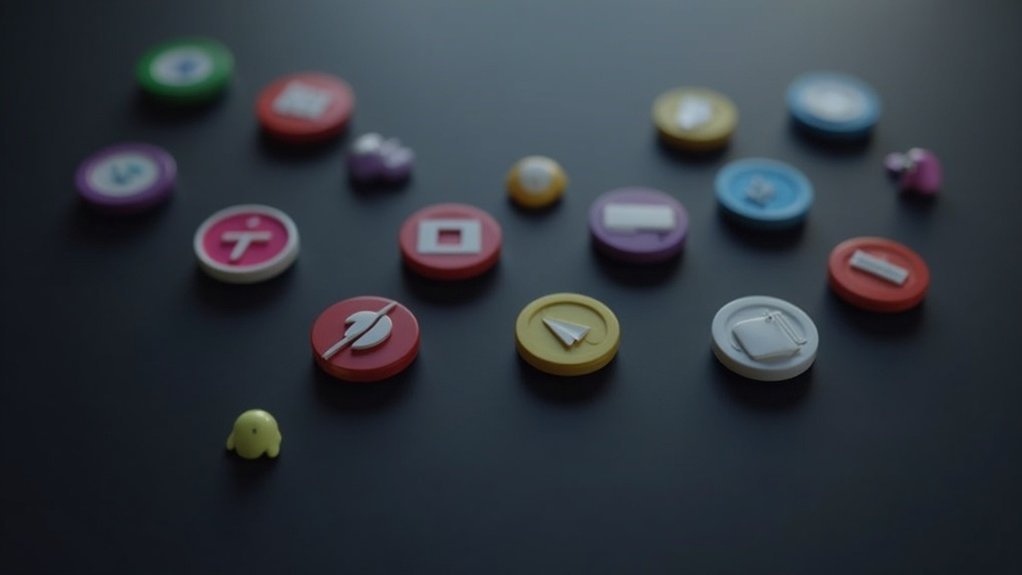
To communicate features quickly, you should consider icon sets like Material Icons, Ionicons, and Heroicons. These icons prioritize clarity and simplicity, making them easily recognizable. Consistent design elements, high-quality visuals, and customizable options enhance their usability across projects. Additionally, pairing icons with descriptive text can further improve comprehension. If you’re curious about more effective icon sets and how to integrate them seamlessly into your UI design, keep exploring the options available to you.
Key Takeaways
- Material Icons provide a modern design approach, ensuring quick recognition through clarity and simplicity.
- Ionicons offer over 700 clear icons, making them suitable for various web and mobile applications.
- Heroicons deliver pixel-perfect clarity, ideal for React and Vue projects, enhancing feature communication.
- Feather Icons focus on minimalistic designs, promoting improved readability and quick understanding of actions.
- Tabler Icons feature over 5,000 customizable options, catering to diverse UI styles for effective feature representation.
Key Characteristics of Effective Icon Sets
When you’re selecting an icon set, it’s important to prioritize clarity and simplicity. Effective icon sets enhance recognition and usability through consistent design elements, like uniform line thickness and shapes.
Look for high-quality icon sets that offer a broad range of relevant icons tailored to your project needs. Make sure these icons come in various file formats, particularly SVG and Figma, for easy integration into your design workflows.
Additionally, opt for sets featuring search functionality and categorization features, allowing you to swiftly locate the icons you need. This approach streamlines your design process, promoting effective communication of features.
Top Icon Sets for Quick Feature Communication
Choosing the right icon set can greatly enhance your project’s feature communication. For modern design and design consistency, consider Material Icons; they offer a vast selection that aligns with Material Design principles.
Selecting the ideal icon set significantly improves feature communication within your project, ensuring consistency and modern design appeal.
Ionicons provide over 700 clear icons, perfect for web and mobile applications. If you’re using React or Vue, Heroicons deliver pixel-perfect clarity.
For a minimalistic approach, Feather Icons prioritize readability with their simple designs. Finally, Tabler Icons boast over 5,000 customizable options, ensuring adaptability to various user interface styles.
These icon sets streamline quick feature communication, helping users instantly understand your application’s functionality.
The Importance of Clarity and Simplicity in Icon Design
Clarity and simplicity are key elements in effective icon design, as they allow users to quickly grasp the intended action or concept. High-quality icon sets prioritize recognizable symbols and minimalistic designs, enhancing user experience by reducing visual clutter.
Cohesive sets like Material Icons and Ionicons exemplify intuitive design, maintaining uniform line thickness and shapes for immediate comprehension. This clarity fosters better visual communication, guiding users effortlessly through navigation.
When icons are easily distinguishable at different sizes, they become powerful tools that streamline interactions, reinforcing the importance of simplicity in icon design for peak engagement and understanding.
Customization and Versatility in Icon Usage
Customization and versatility in icon usage are essential for ensuring that your design aligns with specific branding and functional needs. High-quality icon sets provide flexibility, enhancing your design workflow.
Consider these aspects:
- Easy to use: Customizable options for size, stroke, and color.
- Diverse styles: Adaptable icons for both web and app projects.
- Extensive libraries: Thousands of icons available for varied visual language.
- Browser-based modifications: Quick adjustments to fit your branding effortlessly.
Best Practices for Integrating Icons Into UI Design
When integrating icons into UI design, it’s crucial to prioritize user understanding and engagement. Use universally recognized icons, like magnifying glasses for search, to facilitate quick comprehension.
Pair icons with descriptive text labels for complex actions, enhancing clarity. Maintain consistency in icon styles, sizes, and spacing to create a cohesive visual experience that aids navigation.
Utilize high-contrast colors to improve visibility and boost interaction rates. Finally, make sure your icon touch targets are at least 48pt by 48pt, with 8pt spacing, to enhance usability on touch devices and prevent accidental presses during usability testing.