A brand kit standardizes visuals for contributors by offering clear design guidelines, ensuring consistent application of logos, colors, and typography. This fosters brand recognition and builds trust, as 94% of first impressions depend on effective design. By providing templates and detailed usage scenarios, contributors can create cohesive marketing materials effortlessly. This unified approach not only enhances visual identity but also strengthens overall brand presence. Keep exploring, and you’ll discover how to create an impactful brand kit.
Key Takeaways
- A brand kit provides clear design guidelines, ensuring contributors understand how to use logos, colors, and typography consistently.
- Standardized templates streamline the design process, making it easier for contributors to create visually cohesive marketing materials.
- Defined color palettes and typography guidelines foster uniformity across various platforms, enhancing brand recognition and trust.
- Imagery style guidelines help maintain a consistent visual aesthetic, aligning all contributions with the brand’s identity.
- Regular updates based on feedback ensure that the brand kit remains relevant and effective for all contributors.
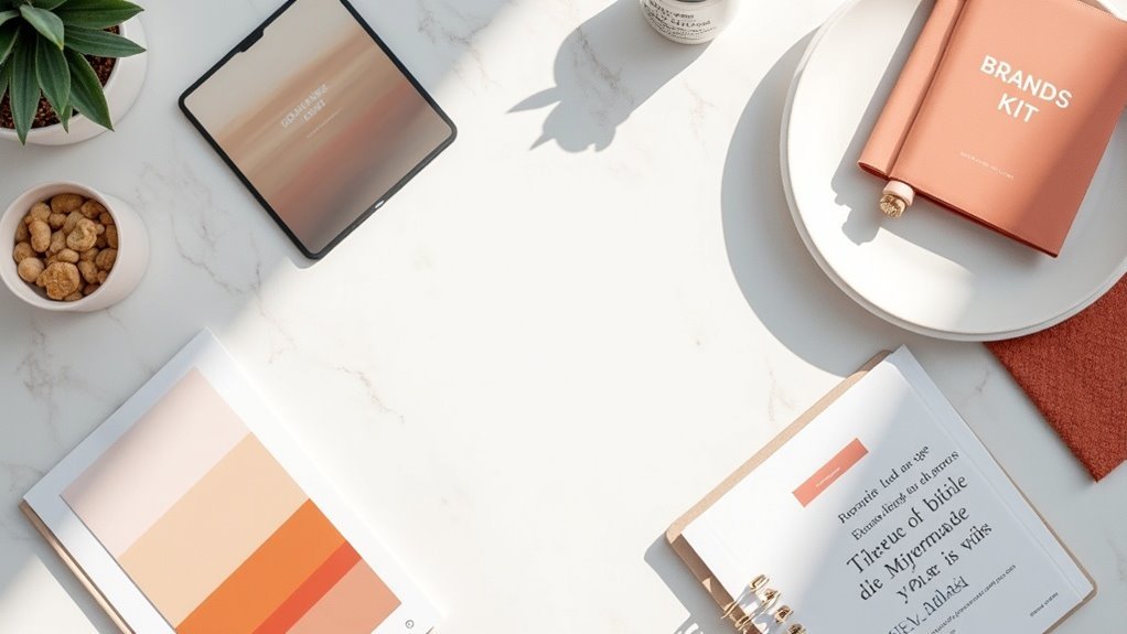
What Is a Brand Kit?
A brand kit is your extensive toolkit for establishing a unified visual identity across all your marketing efforts.
It includes essential visual elements like logos, brand colors, and typography guidelines, ensuring brand consistency in every piece of content.
By providing clear design guidelines, a brand kit empowers you and your team to create visual assets that resonate with your audience.
This standardization not only enhances collaboration but also boosts brand recognition by maintaining a cohesive look and feel.
Ultimately, a well-structured brand kit contributes to effective marketing strategies, driving increased engagement and potentially elevating revenue by as much as 23%.
The Importance of Standardizing Visuals
When you standardize visuals across your brand, you’re not just creating a uniform look; you’re greatly enhancing your brand’s recognition and trustworthiness.
A well-defined brand identity kit guarantees consistent branding, allowing contributors to utilize design templates and brand assets effectively. This cohesive visual identity fosters trust with your audience, as 94% of first impressions hinge on design factors.
Key Components of a Brand Kit
Creating a thorough brand kit is essential for establishing a recognizable and cohesive brand identity. Key components include a defined color palette, ensuring consistent branding through specific codes for print and digital formats.
A comprehensive brand kit is vital for a cohesive and recognizable brand identity.
Typography guidelines outline font choices for headings and body text, promoting uniformity in written communications. Detailed logo usage scenarios help contributors understand the correct contexts for each logo, reinforcing your visual identity.
Additionally, imagery style guidelines specify approved photography and graphic styles, enabling contributors to produce high-quality images that align with the brand’s personality.
Together, these brand elements create a cohesive design framework for effective visual communication.
Steps to Create an Effective Brand Kit
To establish a strong brand identity, you must first define your brand’s core elements, such as its vision, mission, values, and personality traits. Next, create a brand kit that includes guidelines for logo usage, color palettes, and typography to guarantee consistent visuals. Develop templates for marketing materials, streamlining the design process. Incorporate visual attributes that convey your visual identity’s mood, clarifying acceptable graphics and photography styles. Finally, regularly update your brand kit based on audience feedback and performance metrics to keep it relevant.
| Core Elements | Visual Guidelines | Marketing Templates |
|---|---|---|
| Vision | Logo Usage | Business Cards |
| Mission | Color Palettes | Social Media Posts |
| Values | Typography | Brochures |
| Personality Traits | Imagery Style | Email Signatures |
Examples of Successful Brand Kits
How do successful brands maintain a cohesive identity across diverse platforms? Brands like McCormick and T-Mobile exemplify this through their successful brand kits.
McCormick provides detailed visual assets, including logo usage scenarios, ensuring brand consistency in various contexts.
T-Mobile’s accessible brand kit allows external partners to leverage approved assets, enhancing brand recognition after their merger.
These kits feature extensive color palettes, typography guidelines, and imagery styles, enabling contributors to maintain visual uniformity.